Principles of Information Display for Visualization Practitioners
by Al Globus (globus@nas.nasa.gov), CSC @ NASA Ames Research Center
NASA Contract NAS 2-12961
28 November 1994
Note: a German translation by Jens Meiert is available
here.
Introduction
This paper is intended to give the visualization
practitioner an overview of Edward Tufte's work
on information display. Dr. Tufte has written two
classic books on information display: The
Visual Display of Quantitative Information
and Envisioning Information. I
believe that many of the concepts in these books
are important to scientific visualization, but are
often not applied by practitioners.
Much of this paper is Tufte paraphrased; e.g.,
where Tufte might say `graphical excellence', I
write `visualization excellence'. When you see the
word `ink' (paper technology!), think `non-back-ground pixels'.
Passages in
quotation marks are direct quotes. Most of the text is a re-wording of
Dr. Tufte's ideas, but all comments on the current
state of visualization belong to me; and I am
responsible for all errors.
The reader is encouraged to read Tufte's books.
The treatment here is brief,
incomplete, picture-poor, and low resolution.
Excellence
Visualization excellence
- "consists of complex ideas communicated with
clarity, precision, and efficiency.
- is that which gives to the viewer the greatest
number of ideas in the shortest time with the least
ink in the smallest space.
- is nearly always multivariate.
- requires telling the truth about the data."
Visualizations should
- "show the data
- induce the viewer to think about the substance
rather than about methodology, graphic design, the
technology..., or something else
- avoid distorting what the data have to say
- present many numbers in a small space
- make large data sets coherent
- encourage the eye to compare different pieces of data
- reveal the data at several levels of detail, from a
broad overview to the fine structure
- serve a reasonably clear purpose: description,
exploration, tabulation, or decoration
- be closely integrated with the statistical
and verbal descriptions of a data set."
Principles
Visualizations should strive towards the following
goals:
- content focus
- comparison rather than mere
description
- integrity
- high resolution
- utilization of classic designs and concepts
proven by time.
Content Focus
"Above all else show the data." The focus should
be on the content of the data, not the visualization
technique. This leads to design transparency.
Avoid "fooling around with data" and use a clear,
simple, straight-forward design with a richness of
data. The success of a visualization is based on
deep knowledge and care about the substance, and
the quality, relevance and integrity of the content.
Assume that the viewer is just as smart as you and
cares just as much. Never `dumb-down' a visualization.
Comparison vs. Description
"At the heart of quantitative reasoning is a single
question: Compared to what?" Most visualizations
today are descriptive rather than comparative.
This may be part of the reason why scientific
graphics, even those about multivariate
phenomenon, are dominated by the xy-plot. The xy-plot
invites reasoning about causality in a way that
even the most impressive isosurface does not.
We should strive for relational, rather than
merely descriptive, visualizations.
To focus a visualization on "Compared to
what?" enforce visual comparisons, particularly
within the eyespan. Avoid relying on the
viewer's memory to make visual comparisons; a
weak facility in most of us.
Integrity
Misleading visualizations are common.
Although the following suggestions are tuned to
statistical graphics, following a few of Dr.
Tufte's rules may help limit unintentional visualization lies:
- "The representation of numbers, as physically
measured on the surface of the graphic itself,
should be directly proportional to the numerical
quantities represented.
- Clear, detailed, and thorough labeling should
be used to defeat graphical distortion and ambiguity.
- Write out explanations of the data on the
graphic itself. Label important events in the data.
- Show data variation, not design variation.
- The number of information-carrying (variable)
dimensions depicted should not exceed the number of
dimensions in the data.
- Graphics must not quote data out of context."
There is even an equation to quantify one
approach to lack of integrity, the lie factor.
Lie-factor = size-of-effect-shown-in-visualization / size-of-effect-in-data.
High Resolution
Human eye registers 150 Mbits and can understand this
avalanche of data because it is connected to a terrific editor:
the brain. Consider some
information sources in this context:
- 8 Mbits - good PC screen
- 24 Mbits - high end workstation screen
- 25 Mbits - 35mm slide
- 150 Mbits - large topographic map
Consider also the character density of some information forms:
- 5-15 Kcharacters/page - non-fiction best sellers
- 10-18 Kcharacters/page - telephone books
- 28 Kcharacters/page - reference books
Nobody uses a 1200 baud modem when a 56 Kbit
leased line is available. Similarly, we should not
accept any less than the maximum information
transfer rate for our visualizations. Not only is the
information density of the computer screen somewhat low,
it is further reduced in visualization packages that allocate
only a smallish portion of the
display to data and the rest to widgets and other
"computer administrative debris."
Classic Designs
Tufte has researched a number of classic information designs and
general principles. Some of these
are small multiples, time series, and micro/macro
composition.
Small Multiples
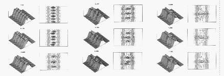
A. Ghizzo, B. Izrar, P. Betrand, E. Fijalkow, M. R. Feix, and
M. Shoucri, "Stability of Bernstein-Greene-Kruskal Plasma
Equilibria: Numerical Experiments Over a Long Time,"
Physics of Fluids, 31 (January 1988).
A small multiple design consists of a single design
repeated several times within the eyespan, each
example showing a different value of the
independent variable(s). "Comparison must be enforced
within the scope of the eyespan," a task at which
small multiples excel. Thus, "for a wide range of
problems in data presentation, small multiples are
the best design solution." "At the heart of
quantitative reasoning is a single question: Compared
to what? Small multiple designs, multivariate
and data bountiful, answer directly by visually
enforcing comparisons of changes, of the
differences among objects, of the scope of alternatives."
"Well designed small multiples are
- inevitably comparative
- deftly multivariate
- shrunken, high density graphics
- usually based on a single large data matrix
- drawn almost entirely with data-ink
- efficient in interpretation
- often narrative in content, showing shifts in the
relationship between variables as the index variable
changes (thereby revealing interaction or multiplicative effects)."
Note that "simultaneous two-dimensional indexing
of the multiplied image, flatland within flatland,
significantly deepens displays, with little added
complication in reading."
Small multiples are a straightforward extension to
many current visualization systems,
although graphics performance may be a problem.
Time Series
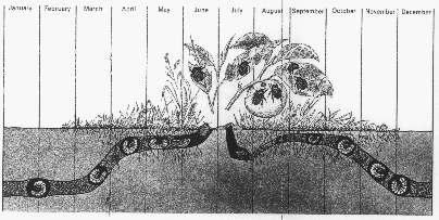
L. Hugh Newman, Man and Insects
(London, 1965), pp. 104-105.
"The time-series plot is the most frequently used
form of graphic design." One dimension, usually the
horizontal, is time, and the graphics march along
showing variation as time proceeds.
Most visualization time-series works are videos, which show time
by changing the picture, requiring the user to
remember what came before. Finding innovative
ways to incorporate time-series into visualization
systems should be given serious consideration.
Micro/Macro Composition
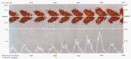
Diagram by David H. Hathaway, Marshall Space Flight Center, NASA.
Micro/macro composition refers to an approach
where a visualization contains enormous detail, but
an overall pattern emerges. "Panorama, vista, and
prospect deliver to viewers the freedom of choice
that derives from an overview, a capacity to compare
and sift through detail. And that micro-information,
like smaller texture in landscape perception,
provides a credible refuge where the pace of visualization
is condensed, slowed, and personalized."
Design Guidelines
This section summarize
design guidelines and principles found in
Tufte's work.
Visualizations "are paragraphs about data and
should be treated as such." Words, pictures, and
numbers are all part of the information to be
visualized. All should be integrated together, not
separated into word processor documents,
spread sheet tables, and visualization package
screens.
Here are some guides for workaday designs:
- "have a properly chosen format and design
- use words, numbers, and drawing together
- reflect a balance, a proportion, a sense of relevant scale
- display an accessible complexity of detail
- often have a narrative quality, a story to tell
about the data
- are drawn in a professional manner, with the
technical details of production done with care
- avoid content-free decoration, including chartjunk"
Definition: Chartjunk - miscellaneous graphic
gunk attached to a chart (visualization) that has
nothing to do with the data and everything to do
with poor taste.
Data-ink ratio
There is at least one quantitative measure of a
visualization, here expressed in terms of ink
rather than pixels. The translation is straightforward.
"Data-ink ratio = data-ink / total ink used to print the graphic
= proportion of a graphic's ink
devoted to the non-redundant display of
data-information = 1.0 - proportion of a graphic that
can be erased without loss of data-information"
One should
- "maximize the data-ink ratio,
within reason"
- "erase non-data-ink, within
reason"
- "erase redundant data-ink,
within reason"
This leads to tight visualizations with a minimum of extraneous junk.
We see that "for non-data-ink, less is more.
For data-ink, less is a bore." This suggests
five principles of data graphics:
- "Above all else show the data.
- Maximize the data-ink ratio.
- Erase non-data-ink.
- Erase redundant data-ink.
- Revise and edit."
Just as good prose is often the result of revision and
editing, good visualization requires criticism and rework.
An interesting example of non-data ink erasure is range frames.
The frame of an xy-plot
is non-data ink. Most of the frame can be
erased without loss of information, and if
only the portion of the frame between minimum and
maximum values is left, the frame
provides additional information!
Clutter
When viewing a visualization jammed with
incomprehensible, cluttered graphics, there
is a great temptation to remove data; even
relevant information. But "clutter and confusion are
failures of design, not attributes of
information." If a visualization is too
cluttered, don't remove data, change the design.
Credibility comes from detail and in many
cases one can clarify a design by adding
detail. "High-density designs also allow
viewers to select, to narrate, to recast and
personalize data for their own uses. ... Data-thin,
forgetful displays move viewers toward
ignorance and passivity, and at the same time
diminish the credibility of the source."
Empty space may reduce clutter, but "it is
not how much empty space there is, but rather
how it is used. It is not how much information
there is, but rather how effectively it is
arranged."
Low density computer displays lead to spreading
information out over many screens or dialog
boxes. This leads to the "one damn thing after
another" syndrome which causes users to get
lost in an information maze. Place information
adjacent in space, not stacked in time, to avoid
the `Where am I?' problem.
Layering and Separation
Consider a colormapped surface that requires
annotation. If the colormap uses all possible colors,
positioning annotation will be difficult
because of color clashes. A better approach
might be to use intensity of a single hue for the
colormap, leaving visual space for addition
information; i.e., the annotation. This is an
example of layering and separation. Layering
and separation implies using color or other differentiation
to separate important classes of
information. Maps are often very good examples
of this technique.
1 + 1 = 3 or More
But "effective layering of information is often
difficult... (because) an omnipresent, yet subtle,
design issue is involved: the various elements
collected together... interact, creating
non-information patterns and texture."
"Josef Albers described this visual effect as
1 + 1 = 3 or more."

For example,
consider a single line -- a single graphic element.
Now consider two parallel lines.
Here we have at least three graphical elements,
each of the lines and the space between
them. This 1 + 1 = 3 or more effect is
important, and "most of the time, that surplus
visual activity is non-information, noise, and
clutter." However, "the noise of 1 + 1 = 3 is
directly proportional to the contrast in value
(light/dark) between figure and ground. On
white backgrounds, therefore, a varying range of
lighter colors will minimize incidental clutter."
A particularly common example of 1 + 1 = 3 or more
is boxes around text. "Unless deliberate obscurity is
sought, avoid surrounding words by little boxes,
which activate negative white spaces between word
and box." Note that the box is non-data ink.
Color
"The fundamental uses of color in information design
(are): to label, to measure, to represent or imitate reality,
to enliven or decorate." Dr. Tufte provides a few
specific guidelines on the use of color:
- "Color spots against a light gray or muted field highlight
and italicize data." "Note the effectiveness and
elegance of small spots of intense, saturated
color for carrying information."
- "use colors found in nature, especially those on the
lighter side."
- "For encoding information,... more than 20 or 30
colors frequently produce not diminishing but negative returns."
- "The primary colors (yellow, red, blue) and black
provides maximum differentiation (no four colors differ more)."
- In color maps, use a single hue, Don't use up the
entire color spectrum, or even all of a hue's levels.
Particularly avoid Roy G. Biv (red, orange, yellow, green, blue,
indigo, violet), the color spectrum of the rainbow.
It's good physics, but poor human factors.
Like all multi-hue color maps, the non-equidistant hue changes are perceived as
especially important contours, which they usually are
not. Furthermore, the lighter middle parts of the spectrum
are often perceived as the higher values. Finally,
one needs to constantly remind oneself which color
means high vs. low values. Using a single hue with
variations in intensity allows instant interpretation,
multiple color maps without ambiguity, and leaves
graphical space for layering and separation.
Tufte turns to the Swiss cartographer, Eduard Imhof
for additional insight:
- "Pure, bright or very strong colors have loud,
unbearable effects when they stand unrelieved over
large areas adjacent to each other, but extraordinary
effects can be achieved when they are used sparingly on
or between dull background tones."
- "The placing of light, bright colors mixed with
white next to each other usually produces
unpleasant results, especially if the colors are
used for large areas."
- "Large area background or base-colors should
do their work most quietly, allowing the smaller,
bright areas to stand out most vividly, if the
former are muted, grayish or neutral."
- "If a picture is composed of two or more large,
enclosed areas in different colors, then the picture falls
apart. Unity will be maintained, however, if the colors of
one area are repeatedly
intermingled in the other...."
"Color itself is subtle and exacting. And, furthermore,
the process of translating perceived color
marks on paper into quantitative data residing in
the viewer's mind is beset by uncertainties and
complexities. These translations are nonlinear
(thus gamma curves), often noisy and
idiosyncratic, with plenty of differences in perception
found among viewers (including several percent
who are color-deficient)."
Miscellaneous Admonitions
- "Above all, do no harm."
- Avoid codes, particularly one-time codes and
legends. Place legends directly on the visualization.
- Use the smallest effective distance. "Make every
visual move as small as possible, but keep clarity."
- "Mobilize every graphical element, perhaps several times
over, to show the data."
- Tone down grids. Heavy, dominating grids often
mar a graphic, overwhelming the data. Draw
grids with a thin line and a light color, preferably
grey. Let the data stand out.
- For a few numbers, use a table.
- "Transparent and effective deployment of redundant
signals requires, first, the need--an
ambiguity or confusion in seeing a data display that
can in fact be diminished by multiplicity--and second,
the appropriate choice of design technique."
- There are lots of good graphical designs. You needn't
invent more. Research the literature, find
good information designs, and steal them.
Remember that talent imitates, genius steals.
- "Graphics should tend toward the horizontal, greater
in length than in height. If the nature of the data
suggests the shape of the graphic, follow that suggestion.
Otherwise, move toward horizontal graphics about 50
percent wider than tall"
- Those that do the work should get the credit, sign your
work.
Parting Shots
After a detailed analysis of sunspot diagrams developed
over a few centuries, Tufte writes:
"Note all the different techniques for displaying sunspots
during 380 years of data analysis -- from
Galileo's first precious observation of the solar disks, to
small multiple images, to dimensionality and data
compression, and finally to micro/macro displays
combining pattern and detail, average and variation.
Exactly the same design strategies are found, again
and again, in the work of those faced with a flood of
data and images, as they scramble to reveal, within the
limits of flatland, their detailed and complex information.
These design strategies are surprisingly widespread,
albeit little appreciated, and occur quite
independently of the content of the data. "
"Graphical competence demands three quite different
skills: the substantive, statistical, and artistic."
Visualization competence requires no less.
References
Edward Tufte The Visual Display of
Quantitative Information and
Envisioning Information, Graphics Press,
PO Box 430, Cheshire, CT 06410.